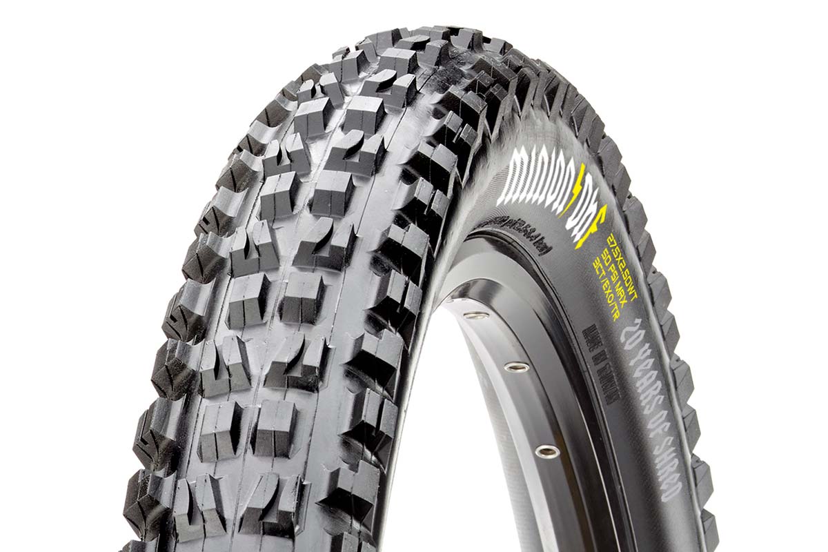
The Maxxis Minion DHF is widely recognized as the benchmark tire in enduro and downhill racing. A success straight off the bat, the tread pattern has barely changed since its inception 2001. 20 Years later, the Minion still going strong, Maxxis have released a limited edition run of the DHF with some sweet decals.
Here’s Braydon Bringhurst laying down some sweet runs on a set of Minions, just like many, many talented riders before him.
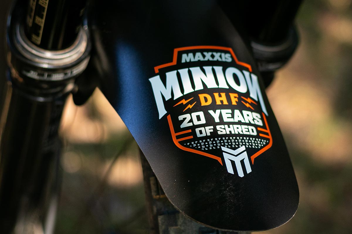
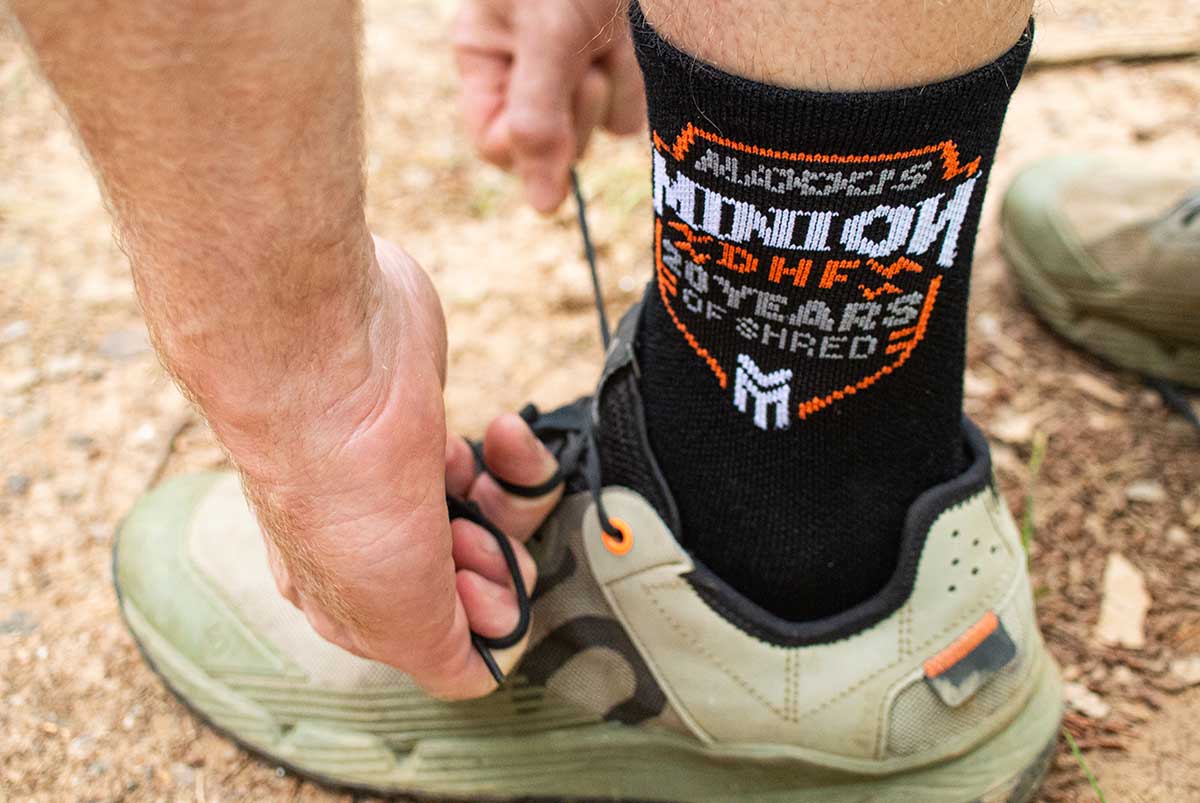
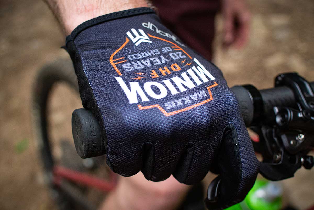
Other than scaling knobs for different sizes of tire, the Minion DHF is essentially unchanged from factory rider Colin Bailey’s original design. The 20th Anniversary limited edition tire gets throwback decals that give a nod to the OG heavy metal font of the original tire. There’s more 20th anniversary themed gear too, including custom gloves from HandUp, socks, and fenders available as well.
The ltd ed Minion DHF is available in 27.5″ x 2.5″ WT and 29″ x 2.5″, both with the 3C Terra compound, EXO casing, and tubeless ready, of course. One tire will set you back $83 USD. Hop to it, these will sell out in no time at all.
All items will be available on the Maxxis US e-store on Monday, August 16 and tires should be arriving at retail locations worldwide in the following days and weeks.