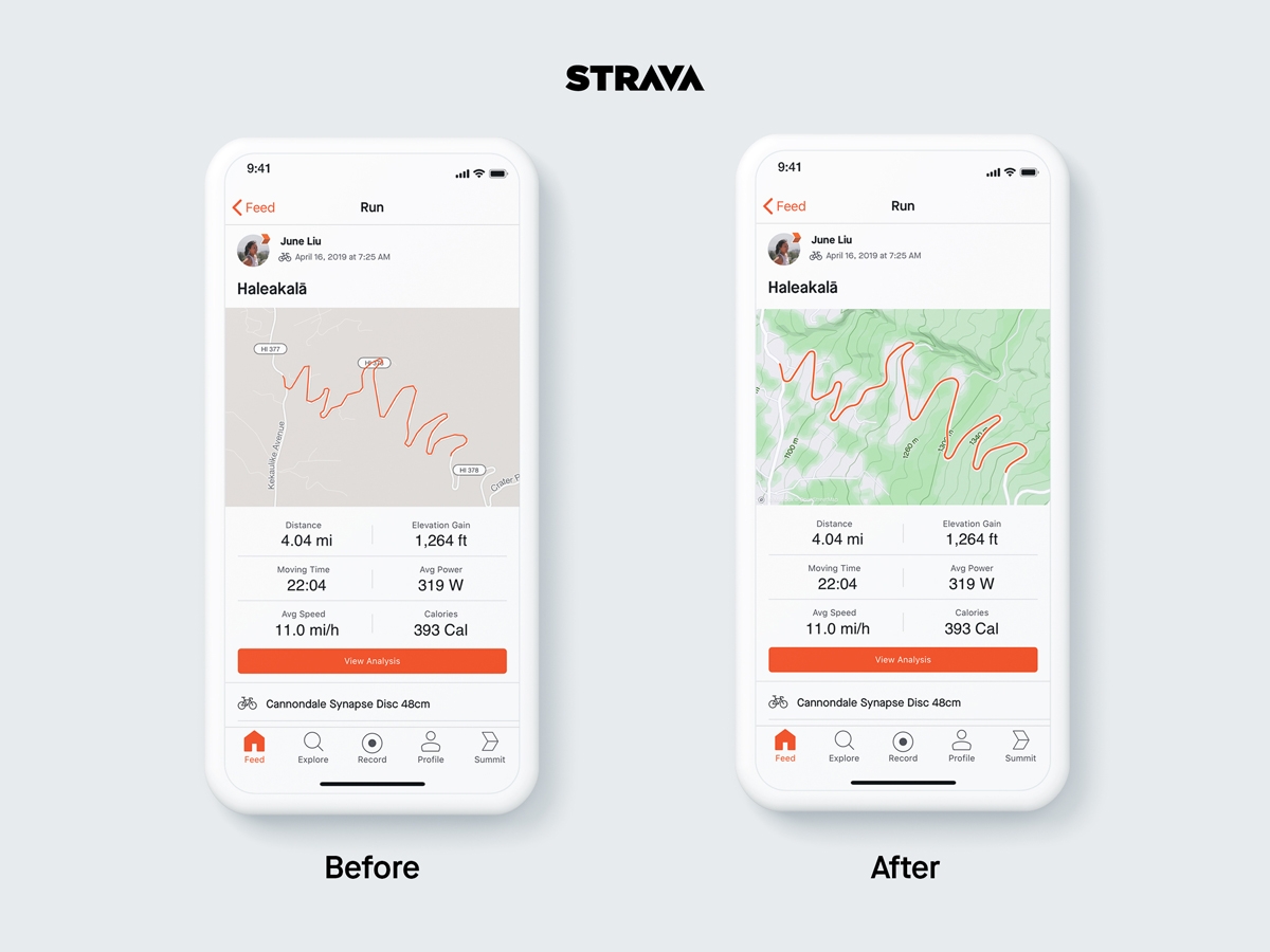
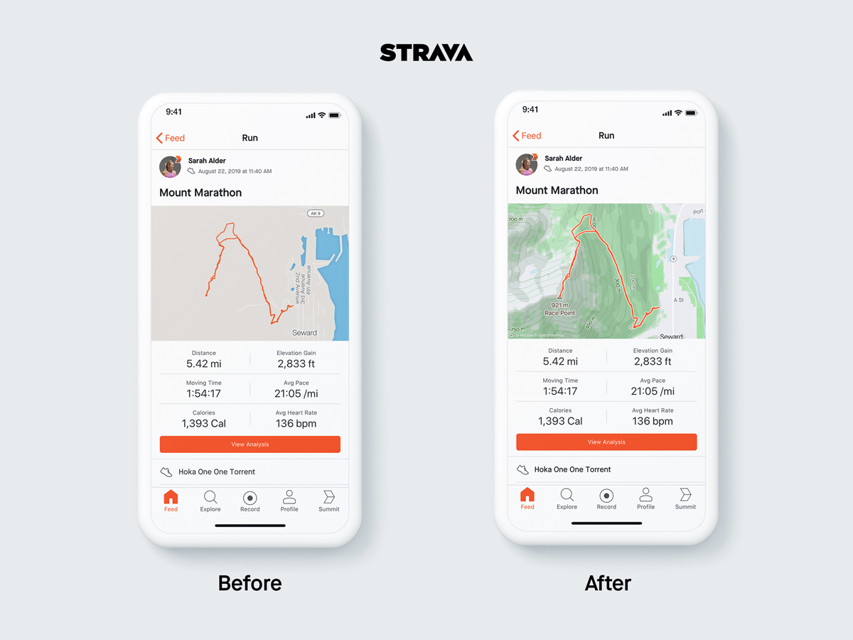
Have you noticed that your Strava feed looks a little better lately? You can thank Strava’s recent partnership with Mapbox for those beautiful new static maps.
Instead of non-descript beige maps, your static maps now feature contour lines and shades of green and grey to match. According to strava, these are completely custom maps that were designed by the teams at Strava and Mapbox. The maps deliberately de-emphasize car oriented features to focus on what cyclists and runners find more important about their routes. While the new maps don’t appear to offer much in the way of additional functionality, they do provide a distinct look that gives your feed a fresh look.

