One of the most used cycling apps continues to get better. Over the past year, Strava has implemented more than 70 updates to their popular app. Now, they’re updating the main navigation bar to make it even easier to use.
Open the app, and the most notable change takes place in the navigation bar that’s at the bottom of the screen. The “Fee, Explore, Record, Profile, and Training” buttons have been replaced with new “Home, Maps, Record, Groups, and You” buttons.
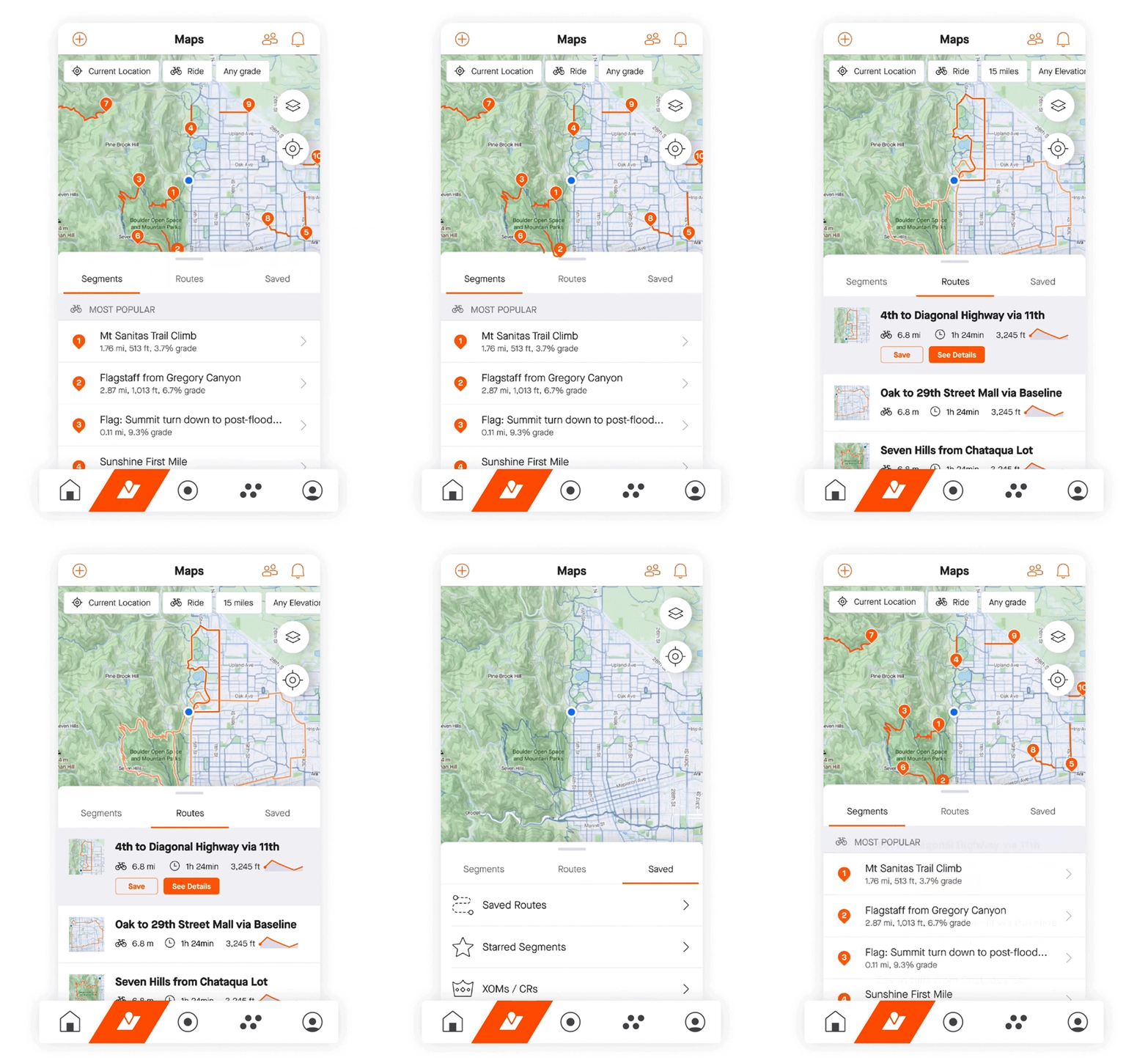
The Home button is pretty obvious, but the new Maps button that replaces the Explore button makes it easier to find segments, explore new routes, and plan your ride.

The Groups button brings up challenges and clubs to make your rides more social. 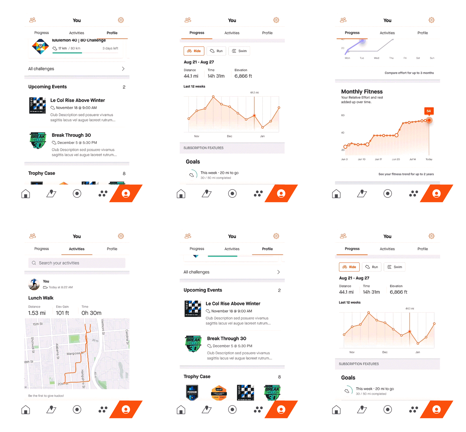
And You? That combines the Profile and Training button previously to bring all of your photos, ride details, and training info into one place.
Additional changes make ‘Settings’ and ‘Find Friends’ always available at the top of the screen for easy access. While the change may take a bit of time to get used to, it seems like a more intuitive layout to make Strava better than ever.
