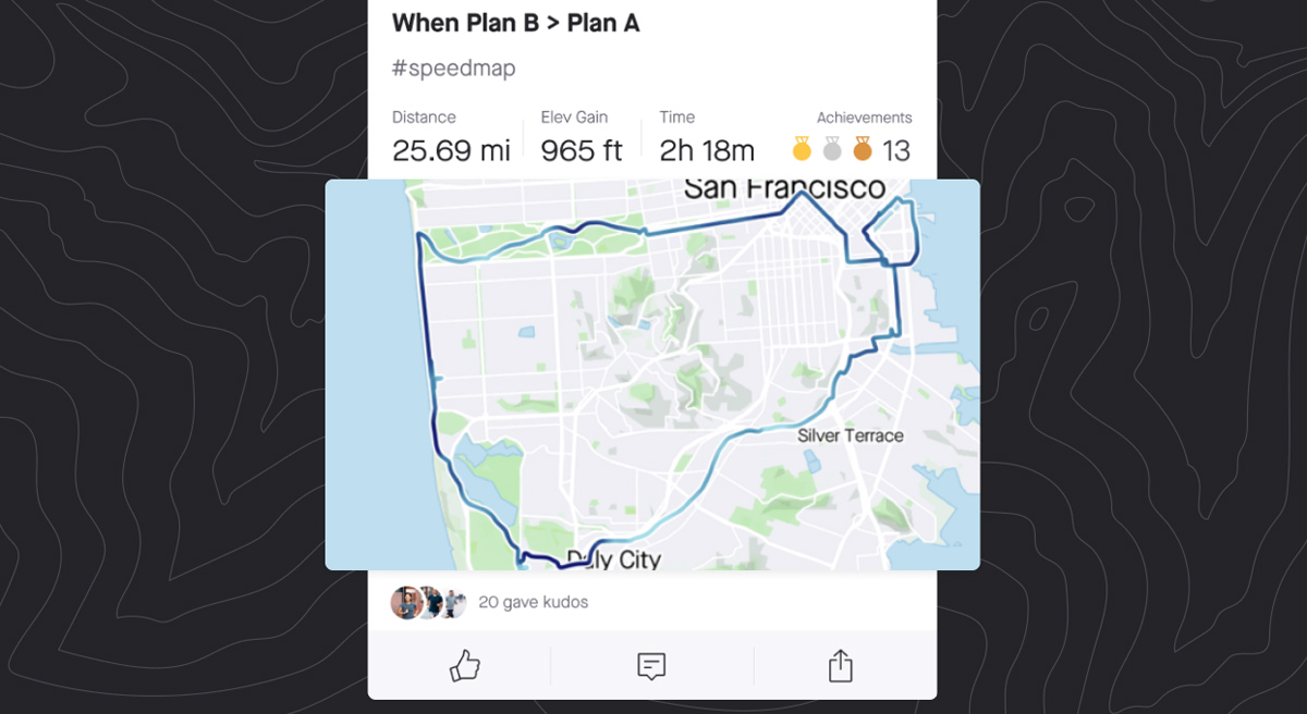
For those of you who open Strava just to scroll through your feed, it’s about to get more interesting and colorful. Well, maybe. Assuming you follow riders who have a paid subscription and choose to use the new #statmap feature, you’ll start to see data-driven maps in a variety of colors.
Similar to many maps created by data acquisition systems, the new Strava #statmaps use different data streams to create a colorful map. Overlaid on your route, the colors represent changes in that data source. Above, the darker the color, the higher the heart rate for this runner.
Additional maps are available for Pace, Speed, Elevation (absolute), Elevation (gradient), Power, Time, and Temperature. To make these maps appear in your feed for others to see, you will need to use one of the corresponding hashtags below in the activity title or description.
-
Pace #PaceMap – Darker colors are faster paces
-
Speed #SpeedMap – Darker colors are faster speeds
-
Heart Rate #HeartrateMap – Darker colors are higher heart rates
-
Elevation (Absolute) #ElevationMap – Darker colors are higher elevation/altitudes
-
Elevation (Gradient) #GradientMap – Red is climbing, Green is descending
-
Power #PowerMap – Darker colors are higher power outputs
-
Time #TimeMap – Darker colors appear later in the activity
-
Temperature #TemperatureMap – Red is hotter
The new feature is only available to subscribers to use to create the maps, but any Strava users will be able to see these maps in their feed if you follow paid subscribers. Subscribers will also be able to retroactively add any #statmap to previous uploads, if you want to play around with the settings.


