Strava has searched for ways both to quantify athlete efforts across different disciplines and to offer a higher level of training data analysis to its premium users. Suffer Score had been Strava’s go-to Premium metric based on heart rate, but now Relative Effort has taken over as a better cardiovascular intensity comparison, also giving a visual representation on mobile devices of your trending training efforts.
Strava Relative Effort premium member training metric
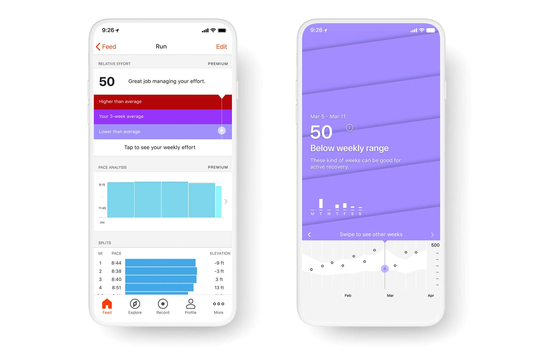
The idea of the new Relative Effort feature is to quickly show athletes how strenuous an activity was on a more level playing field. Personally, it will show more accurate comparison of running & cycling for example, better accounting for variation of time, distance & intensity across disciplines. With group activities, it is said to offer much improved comparison of how each athlete performed relative to their typical training efforts.
The impetus derived essentially from the limitations of Suffer Score which would exaggerate running efforts vs. similar effort cycling or swimming activity, and would also underreport the effort of shorter but very intense training. So the new, reworked metric was developed with sport-focused data scientist Dr. Marco Altini for increased precision in effort comparison.
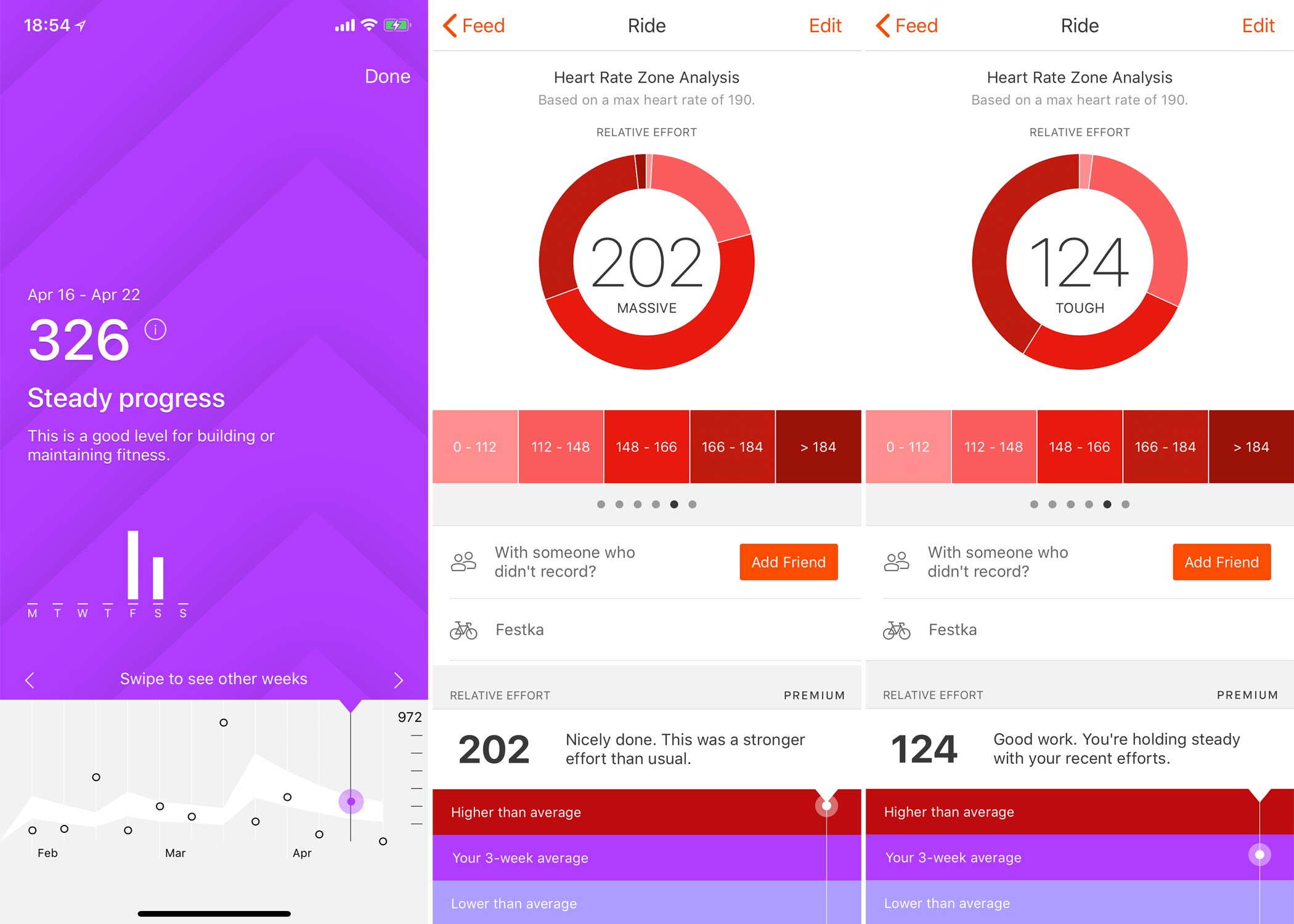
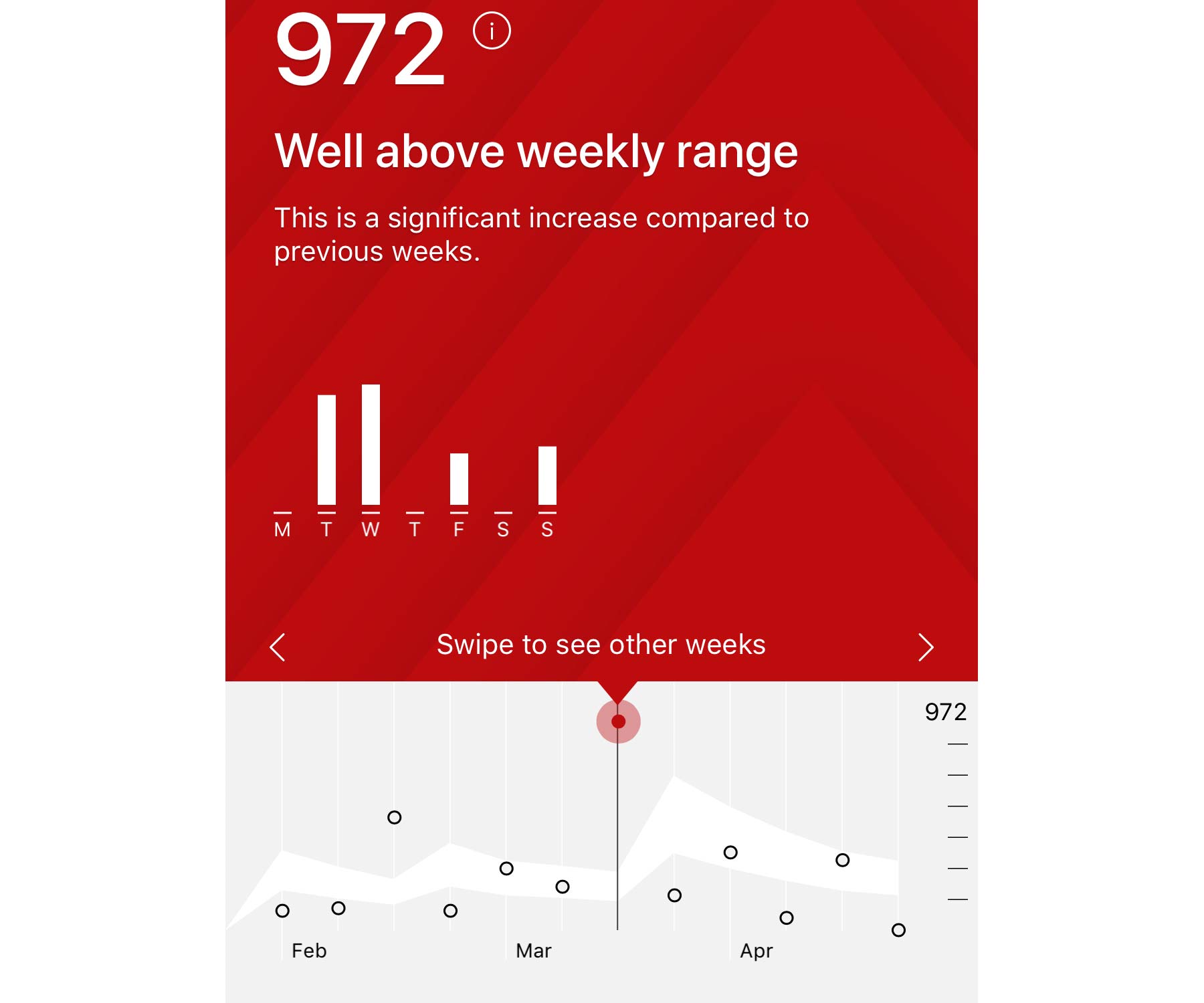
While it might seem like Relative Effort is just a better, updated Suffer Score (yes, it is that), Strava now offers a much more useful trending tool with the new metric that could help athletes better gauge their short to long-term training with less risk of over or under-training. Any activity premium members upload while tracking heart rate monitor now shows a Relative Effort score comparing that activity to your 3-week average. It then also allows you to see a Weekly Relative Effort trend for the last 12 weeks.
That 12 weeks view also indicates a suggested training range (of cumulative Relative Efforts) that can help give athletes a general idea of how much effort to put in the following week to maintain or gradually increase training load, while allowing healthy recovery. To be fair, it is all very generalized and not overly precise. Athletes looking for a detailed, structured training plan most likely should look somewhere else (probably to a reputable coach). But much like the Strava Fitness & Freshness curve tool has provided an easy, user-friendly way to track your levels of fitness, fatigue & form over time via their website, these new Relative Effort trending graphs could help introduce more casual athletes to more thoughtful training.
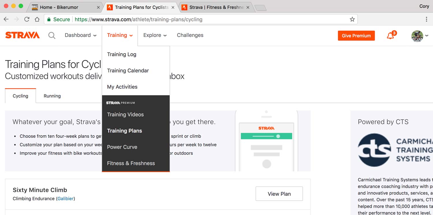
Interestingly, the Relative Effort trends are a mobile app-only feature. While Strava has several other website-only training tools (like Fitness & Freshness, My Goals, Training Plans & Power Curve) this looks like an instance where they are looking to provide more Premium-only member benefit in the mobile app. We’ve heard a number of users who want more Premium functionality in the popular app, so maybe this is a sign that Strava is addressing those Premium member concerns.
If you want to learn more about Relative Effort, Strava’s engineers have written an article on how & why they developed it. Until then, premium users can casual enjoy the new purple and red graphs telling you how you are doing.


