Strava has unleashed more than 50 training updates so far in 2020, like route creation, feed sorting and mobile activity editing. Now they’ve got a few more tricks for subscribers to give them more training options for all of the 32 different activities they let you track.
For mobile users, which is a lot of us, the Summit tab will now be renamed Training, too… making it easier to get to all of this. In fact, “Summit” is going away entirely, and their subscription hierarchy is now back to just a single all-in-one bundle. We’ll explain in a second. But first, let’s check out your new training data screens…
Strava Training Modules sort out your workouts
There are four key updates to the dashboard, which will show up as:
- Activities, with a quick weekly summary that can expand into monthly totals
- Training Log, showing activities as color-coded bubbles on a calendar
- Intensity, based on heart rate, power meter data, or perceived exertion
- Fitness, evaluating recent training efforts vs. recovery
The initial Training dashboard view gives a quick glance at each of the four topics, then as you click through you get more detail.
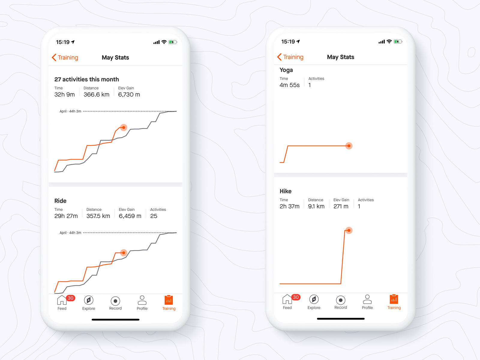
Moving from the Weekly Activities preview, the next level lets you see the chart of progress comparing your Monthly Activities, to last month. Plus, it gives an overview, then sorts out each separate sport with its own graph, so you can see relative change in riding, running, or other cross training.
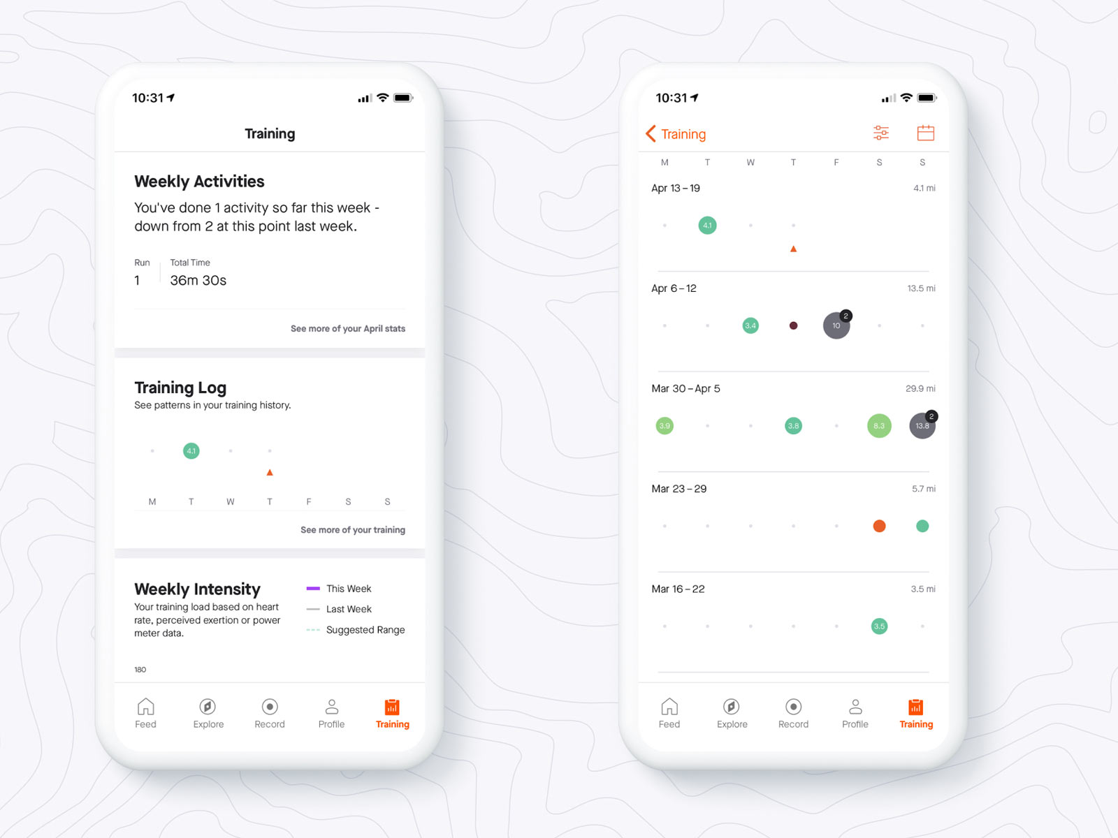
Training log also begins with a weekly overview, then click through to get colorful bubble graphs sorting out different sports, week-by-week for the last five weeks. Essentially, its the same full functionality you already get from the web-based training calendar.
Strava says 20% or more of their premium users (aka paid subscribers) are logging multi-sport activities, so the color coding on the Training Log calendar helps them quickly see what they did each day.
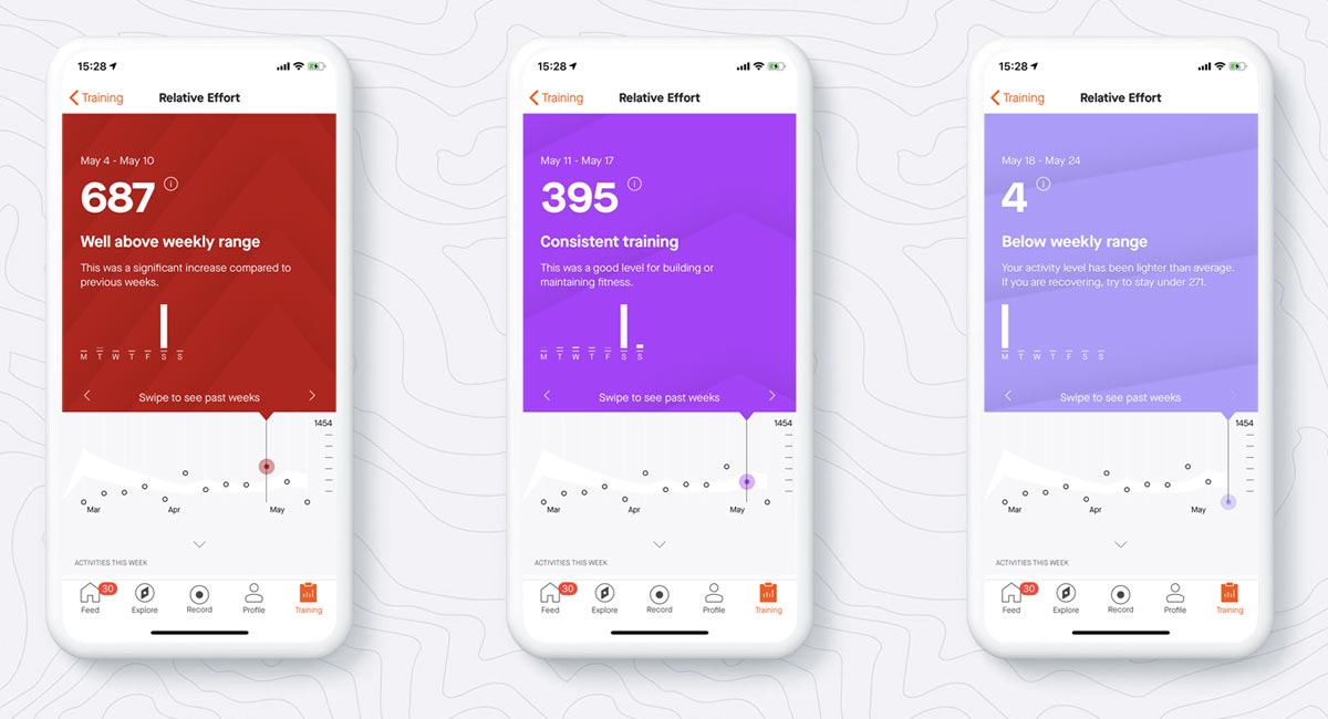
For Intensity, again starts off with a weekly set of stats (not so helpful for me on a Monday). But move through to more detail for the full week-by-week training overview, tracking relative efforts over the past 10 weeks, and the suggested effort range for this week to effectively train. As before, this is all based on your training load and activity intensities, trying to make for an easy way to visualize your efforts over time.
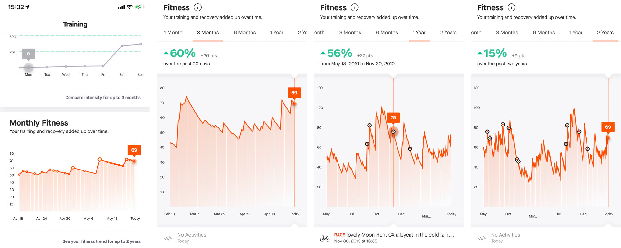
Lastly, Monthly Fitness tracks your progress over time comparing training effort and their intensity to your recovery periods. Essentially this is a pared down version of the web-based Fitness & Freshness display, focusing on your fitness. Click through and see where you stand over the month, quarter, half year, year, or even the last 2 years. You can click anywhere on the graphs to navigate to any individual activity, with activities highlighted as a Race indicated by a black dot that lets you see how you race fitness progressed over time.
Strava Route Builder gets updated for desktop
The Route Builder for mobile has, according to them, been so popular it’s helped them add more paid users. And it was arguably better than the web-based version you’d use on a desktop browser. So they’ve made that one better now, too.
The new web-based Route Builder adds Global Heat Map data and layers it over the underlying Mapox data that powers their mapping system, so you can see where others are riding. It also lets you see standard or satellite view, change the colors, sort by surface type, route for elevation changes, and more.
It also adds Segment Explorer, which will show the 10 most popular segments within the view window. Zoom in or out, or scroll to a new area, and it’ll automatically refresh.
Turn it on manual mode and you can create routes off of existing or known roads, trails and paths. Otherwise, it snaps to known elements to keep your routes from taking you to the middle of nowhere…unless that’s your goal.
Strava Subscriptions are now just $5 per month
Remember the different levels of Strava subscriptions? Packs, Summit levels, and various features you had to figure out whether you wanted or not? Or did you just ignore it because it was confusing (guilty)? Now all of that, and the Summit name, is gone. It’s just Strava in free or subscription mode, and the latter is just $5 per month for everything. Here’s how that changes what you’ll see on the free version…
Want to see how you rank on the leaderboards? Pay Up.
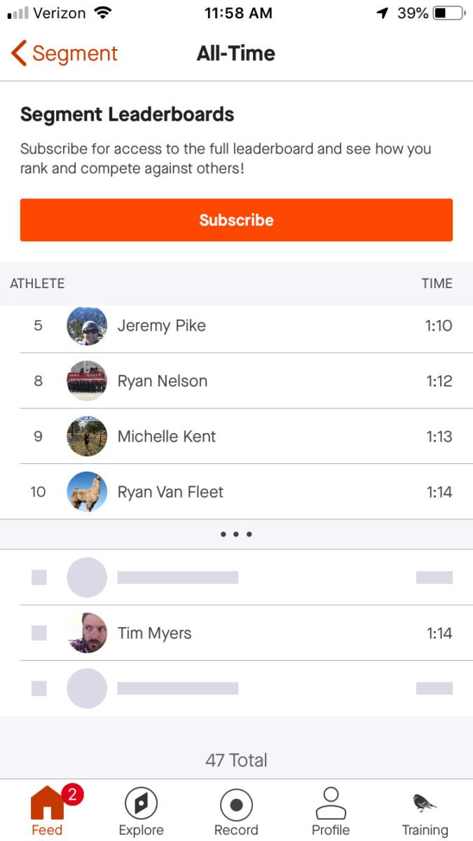
Segments are still free for everyone, but Segment Leaderboards and Segment Efforts are now only on the paid version. If you’re a Free user, you’ll still be able to see the Top 10 men and women for each segment, even if you’re not in it. However, to see where you rank on that leaderboard outside of the Top 10, you’ll need a paid subscription. Above is a screenshot of what you’ll see – your time will be there, but it won’t tell you where you rank or who is around you. You’ll also still receive activity achievements on the free version, and be able to create, explore, search, and flag segments.
SUBSCRIPTION
- All segment leaderboards (except top 10 all-time and top 10 women)
- Analyze segment efforts
- Compare your results
- Analyze your efforts
FREE
- Top 10 all-time and top 10 women
- New Segment Creation
- Segment Detail screen
- Segment Explore / Search
- Flagging Segments
- Activity achievements (XOMs, CRs, PRs)
Why did the Strava subscription plan change?
Simplicity, for one. If it’s easier to explain, it’s easier to sell. After all, they’re a business that needs you to subscribe. The new price is the same as their full Summit program was before, there are just no more lower-cost partial-feature programs.
Like most things, you get what you pay for. If you want all of the cool route building, segment ranking, and fitness tracking features, it’ll cost you a few bucks a month to get it. But there’s no advertising on their platform, and they don’t sell your data. It’s $59 per year when paid annually, which is about $5/month. Pay monthly and it’s $8/month.
But you can try it for free!
Starting today (May 18, 2020), they’re giving all free users a free 60-day trial of the subscription plan. Just be sure to activate it through the app store (on mobile) or with a credit card (on desktop) within 30 days (so, by June 16th to be safe). Then cancel (you’ll get a reminder) before the end of the free trial period if you don’t want it.
For existing subscribers, unfortunately, you won’t get a free 60 day extension to your existing subscription. But they’re working on something else special for you… stay tuned.
