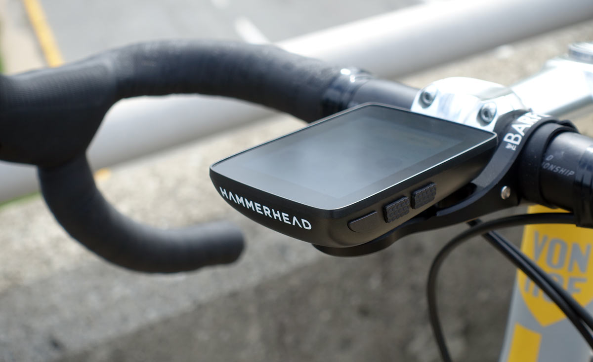
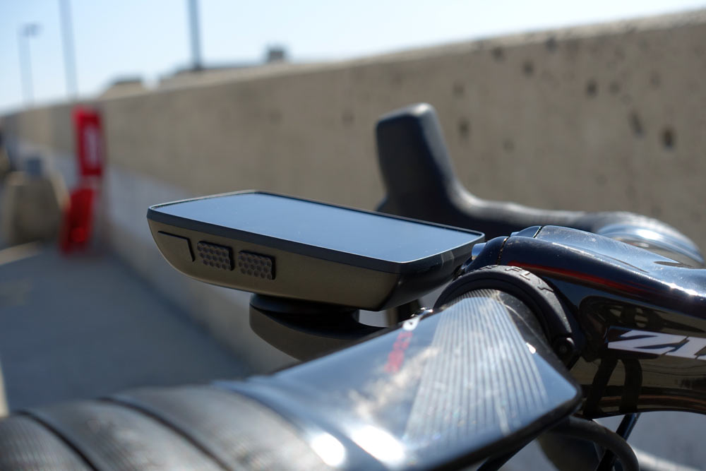
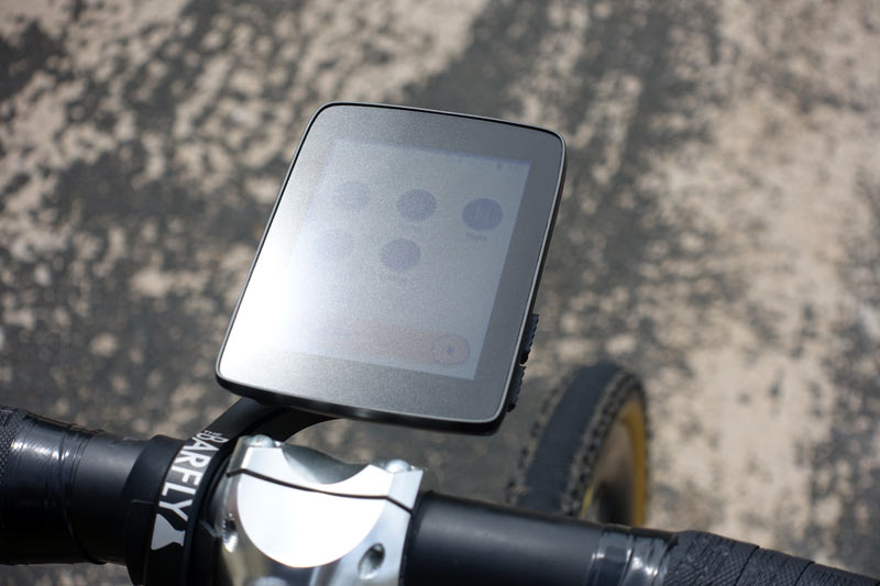
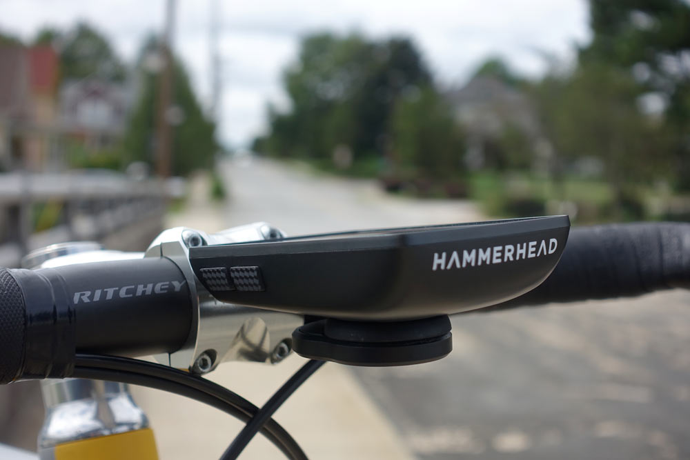
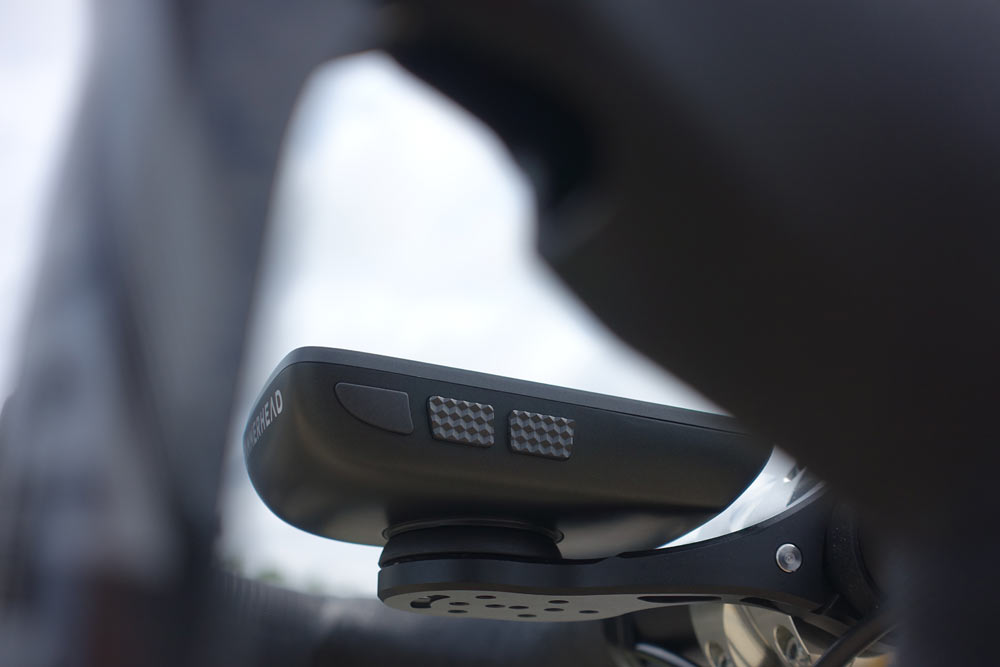
What started out as a simple navigation beacon that used lights to guide you updated to one of the most fully featured and impressively sized GPS cycling computers on the market. Introduced in Spring 2017, it took a while longer for the Hammerhead Karoo to finally get to the market, but it was worth the wait.
In a nutshell, the Karoo is a full color GPS cycling computer that runs on Android OS, but doesn’t need to be paired to anything to do what it needs to do. Which is, give you a massive amount of control over what data you see, for which bike, and guide you down the right path.
To do this, the Hammerhead team is focused exclusively on building the best possible head unit, which means continual refinement of its OS. On average, they push software updates out about every two weeks, taking advantage of their rapid rate of development. And they’ve created a simple but powerful route creation tool on their website, as well as a Chrome plugin, that let’s you make or copy routes from a variety of sources. As you’re about to read, it does a lot of things well, and does several key things that others don’t.
Karoo tech specs & details
Their first product was built mostly around Maps and Navigation. The Karoo expands on that by offering the highest map detail of anything on the market, and navigation responsiveness and real-time rerouting is faster than the competition. That’s their claim, and after using it, I’d agree. Have I tested everything out there? No, but this one’s speed is quite impressive.
Features include Gorilla Glass over a high def screen, and massive attention to fit and finish and user friendliness. Buttons are offset, so as you pinch it to press the buttons on one side, you don’t accidentally push the ones on the opposite side (you know, like with an iPhone…ugh). The matte screen keeps the glare from blinding you, but the adjustable brightness (auto or manual) makes it easy to see even in broad daylight.
It’s waterproof, so the lack of plug or cover for the USB charging port might look concerning, but they say many of those vestiges of older cycling computers and electronics are no longer necessary when you’re using top shelf components. They’ve subjected it to salt spray, submersion, and even frozen it in a block of ice, and it always turns out fine. So don’t sweat that open port (or do sweat on it), you won’t hurt it if it gets wet.
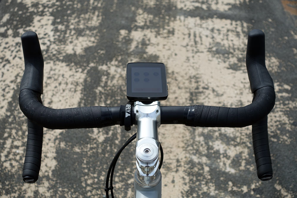
The Garmin-mount compatible foot that attaches it to the bar mount with is replaceable, and it comes with a tether to secure underneath it then loop around the mount…just in case. I’ve ridden it on my cyclocross test course and hit roots hard enough to slide the brake levers down the handlebar and it never popped off.
The touchscreen knows how to deal with water droplets and gloves better than most, so it won’t go nuts if your riding in the rain or sweating on the screen. And if it does get too muddy or wet, you can do everything you need to do with the physical buttons on the side, too.
Unboxing, actual weight & getting started
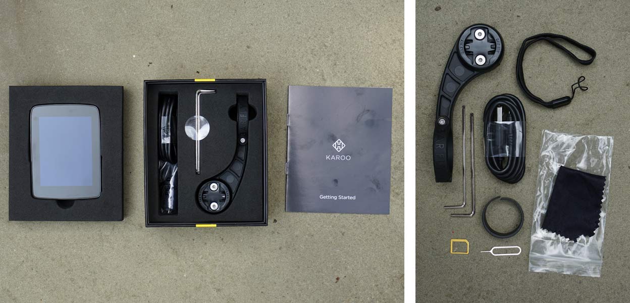
For $499 (or less, it’s going for $399 as of this review being posted), you get everything you need to use it. The package includes hex wrenches to install the Barfly mount, a cleaning cloth, USB cable to charge, tether strap, rubber strap to space out from a 31.8 handlebar to the mount’s 35mm design, and a SIM card sleeve and removal tool.
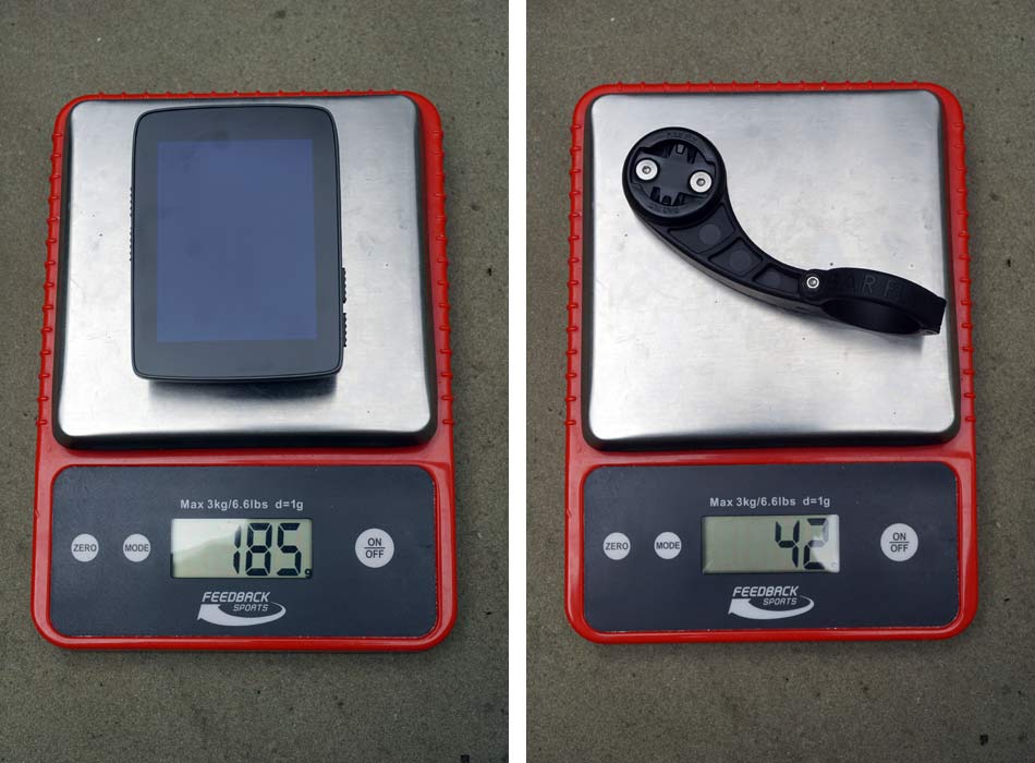
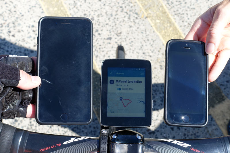
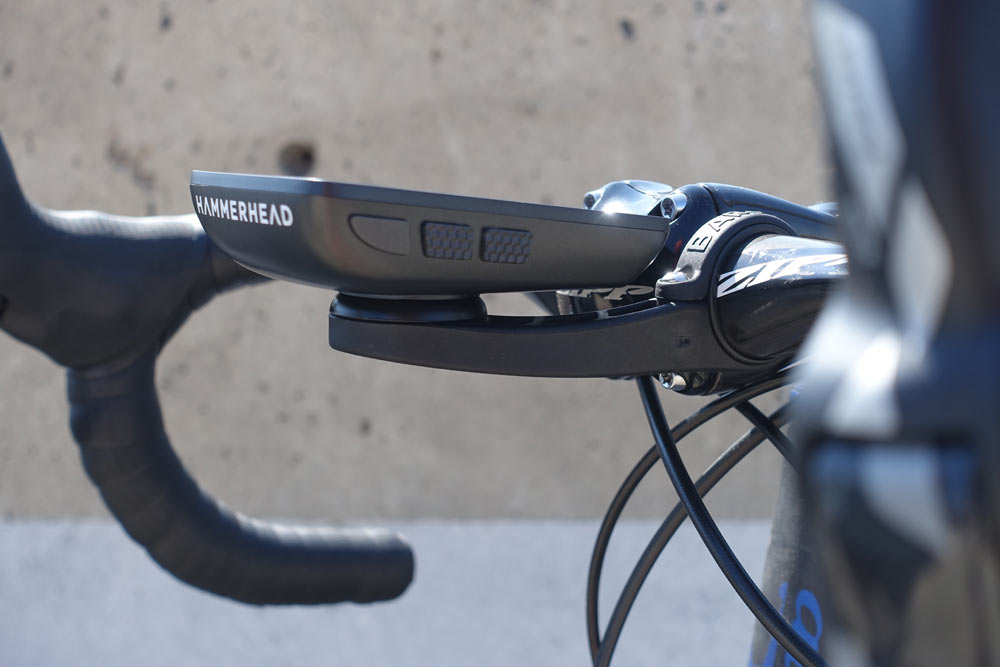
The head unit is large (see comparison photos below), and weighs in at a hefty 185g. The included mount adds 42g. The inclusion of a quality mount with the ability to add light/action camera mounts to the underside is good…not just because it’s one less accessory you’ll need to buy later, but also because the unit’s size can potentially block some handlebar mounted headlights:
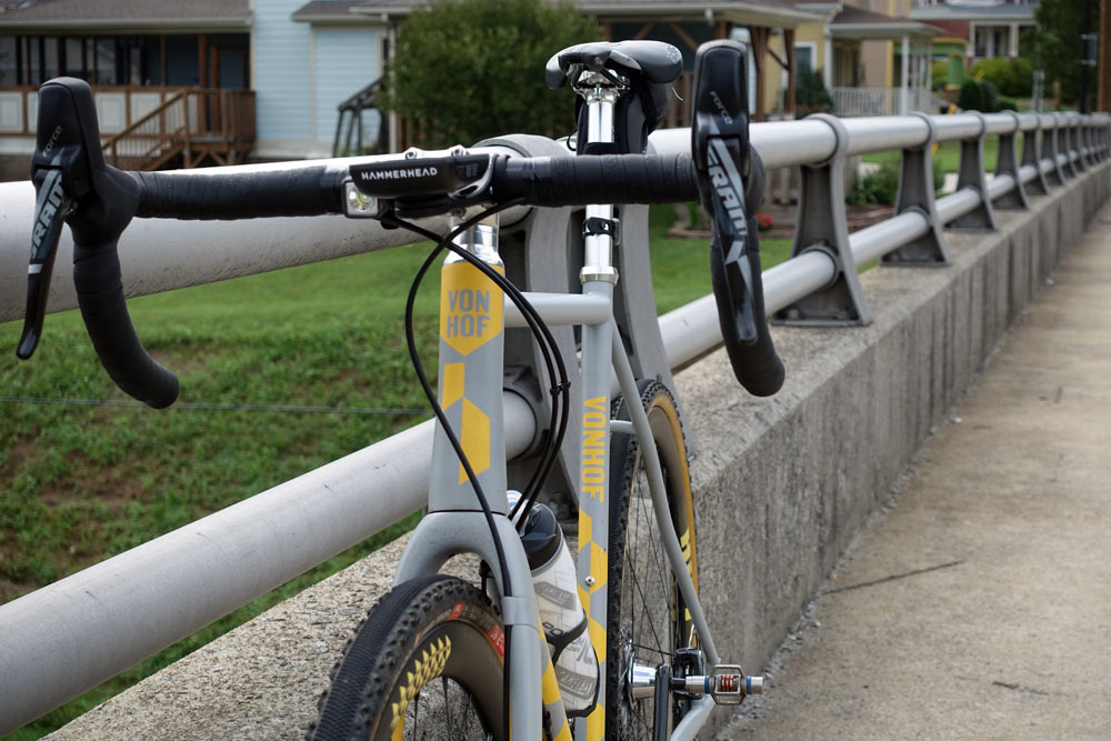
Here’s how it compares to an iPhone 7+ (left) and older 5s (right).
Getting started
Plan on spending about 15 minutes to set it up, pair it to your sensors and do a little customization of the data screens. When you first boot it up, it’ll almost certainly look for an update and want to download it, but each update is fully packaged, so you won’t have to download multiple updates in a row to bring it up to speed. You’ll want to create an account on their website, which is free, easy and literally takes five seconds. Here are just a few of the setup screens worth point out, all of which are edited on the device…so, no need to pair an app (there isn’t one) to update or change any settings.
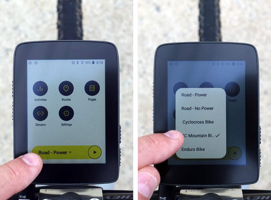
The home screen (left) has buttons leading to anything you’d need to edit, add or use. Click Sensors and you can add and rename your heart rate, power meter and other sensors, helping you identify each part more easily.
Click the yellow button on the bottom to start a ride, and it lets you choose which of the bikes you’re riding (right), which you set up. The beauty of this system is that you can set up the pages and screens for each bike you have based on how you use it and what you want to see for that type of ride. I added these five bikes in about 60 seconds, but then you’ll want to…
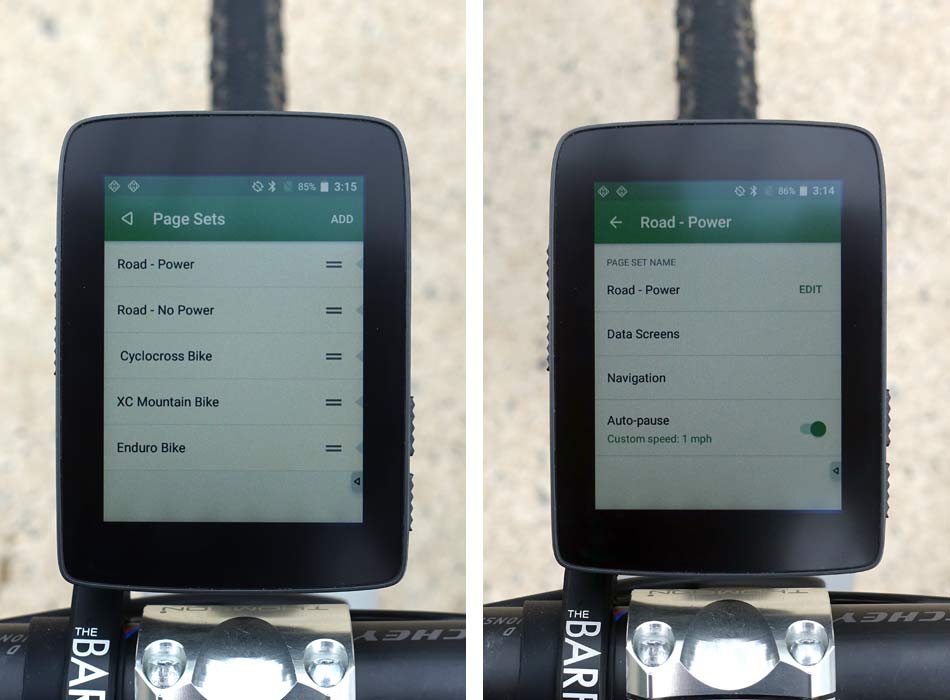
…spend some time setting up the individual pages and screens for each bike. To do that, you have a few options. Starting from the list (left), you can add or delete bikes, or click on the one you want to edit. You’ll then get options (right) for naming the bike, choosing data screens, choosing what data (if any) you want to see on the map screen, and whether or not you want it to auto-pause. This is a nice feature in that you can turn auto-pause on or off for each bike type.
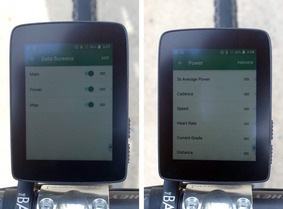
Choose Data Screens (left) and you can edit each of the screens, add or subtract screens and rename or reorder them. While riding, you simply swipe left or right to move between them (or use the physical buttons on the top left of the unit).
Within each screen, you can add up to 12 data fields, BUT, you probably won’t want more than 4 or 5. As you add more fields, they stack on top of each other and the font gets smaller and smaller. I had eight on a screen and it was too much; visually very cluttered. But, you can add as many pages as you want, so just add more pages, each with a few related fields. Personally, I think it’d be nice to allow you to position them side by side or have a couple appear larger, but this works, too.
GPS, mapping & routing is amazing
The Karoo uses both local WiFi networks and optimized GPS antennae placement to help it pick up satellites faster. It is among the fastest I’ve used, which means I can get moving more quickly after turning it on.
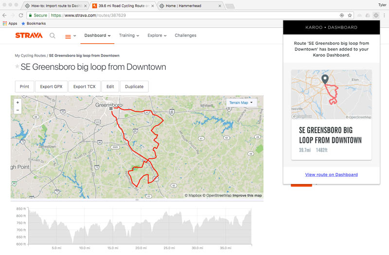
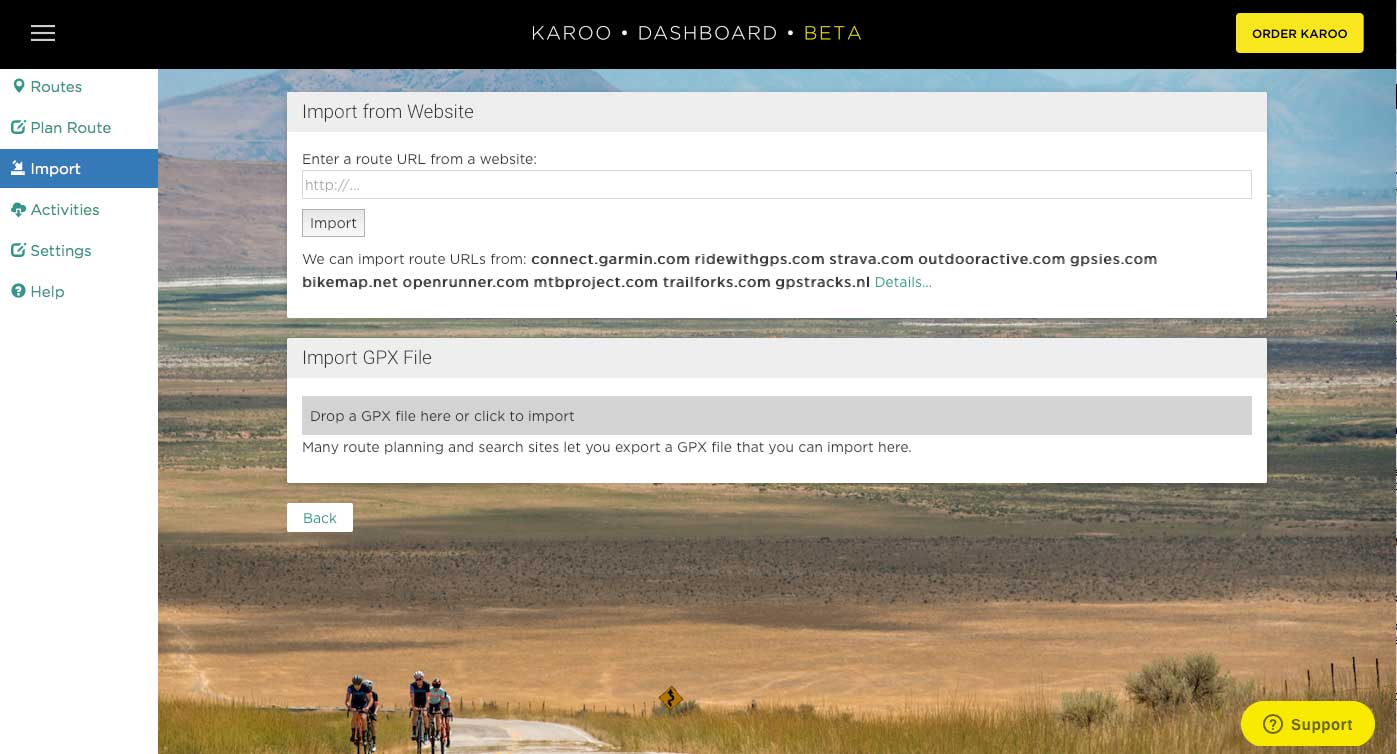
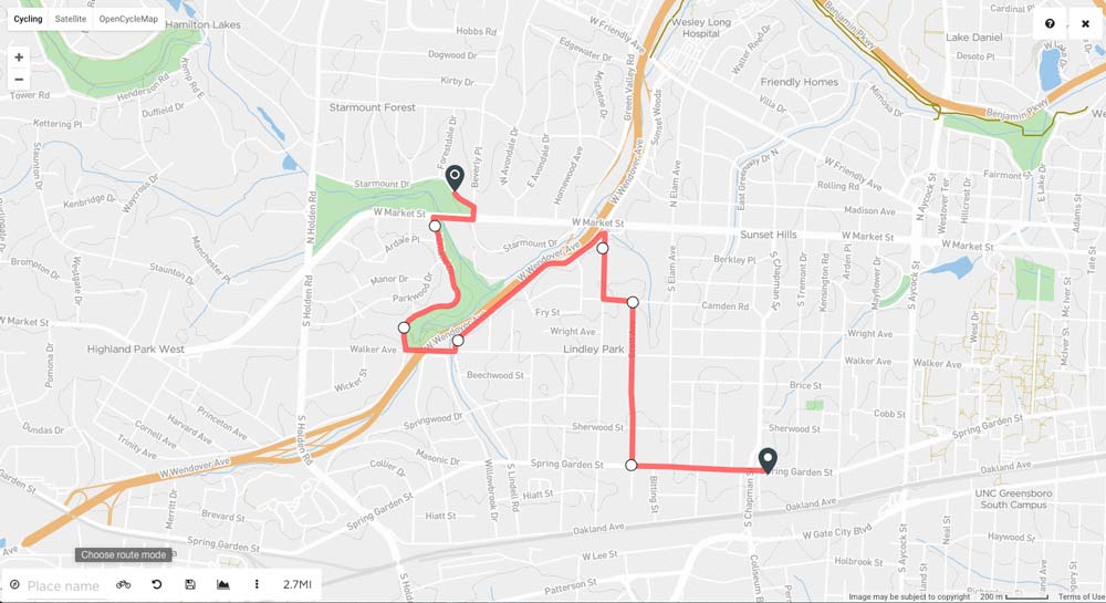
Creating a route is easy to do through their dashboard, either by importing them directly from a file, or creating one from scratch by dropping points on the map. Shown above is one of the coolest features: The ability to create a route on the Karoo from any Strava route. Their free Chrome browser plug-in will grab a Strava ride off your friends’ accounts and automatically create a route and sync it with the Karoo in the background. Technically, if it’s not a public route, you can just create the route from their ride within Strava…for free…then send that route to the Karoo, too. So, basically, any ride anyone’s done on Strava can be turned into a route to use on your Karoo.
But wait! There’s more! Not only can it put that GPX file on the head unit, it can also create turn by turn instructions from it! Normally, you need a TCX file to get the turn alerts through navigation, but Karoo converts that for you.
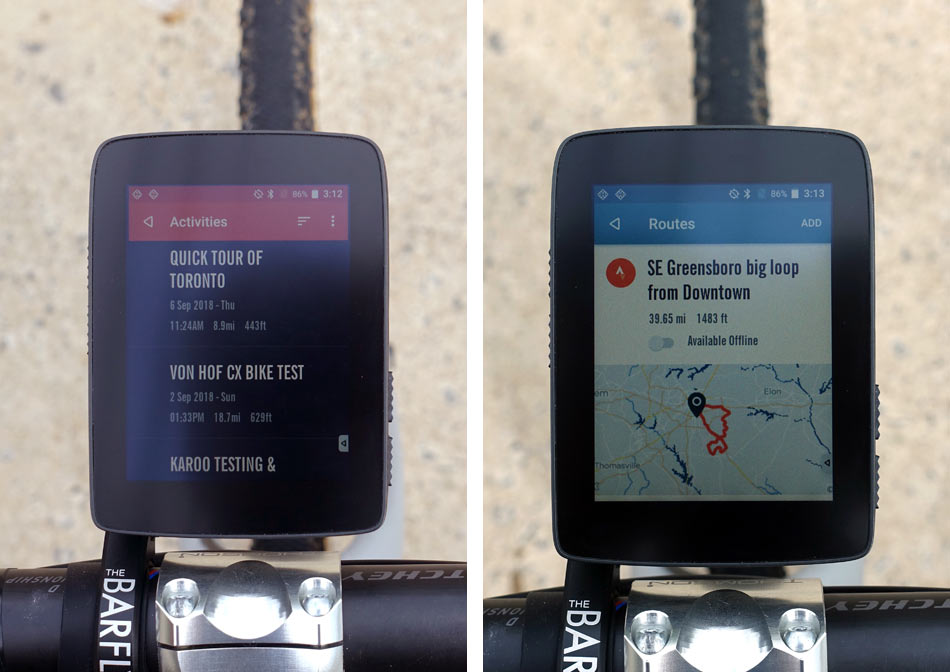
Another nice feature: Once you’ve added any route (from Strava or scratch or file), you can edit the ride name and details in your dashboard before they sync to Karoo. Once on the head unit, you’ll see a list of routes (left) you can choose from. When both my computer and the Karoo were on the same WiFi network (they can be on any network, they just have to be connected to the internet through WiFi), a new route synced to the device within two minutes.
To ride a route, just click on it and hit start. Or, just hit start (that yellow button that lets you pick the bike) and it’ll then give you the option to select a route or just start riding. Or, you can add a route mid-ride if you want. And once you’ve finished a ride, you can save that as a route. You have a lot of options.
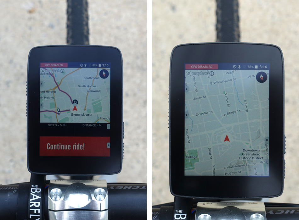
Once you’re riding a route, you can set it up to display it as full screen or with up to two data fields (left, showing blank because I wasn’t moving), and the turn alerts will pop up in red. You can turn those visual alerts off and just follow the arrow and path on the map, too. If you’re on a data-only screen, the red alert can pop up there, too.
I found that the alerts happened quickly enough, but they’re visual only, which is one of my few complaints. An audible alert would be much more helpful as I’m not always looking at the screen, sometimes zoned out. If you miss a turn, it doesn’t “tell” you when to turn next, but it will highlight an alternate route on the map screen (in blue, rather than the intended route’s red highlight) to guide you back to the route. This happens really fast, which is a good thing if you’re in a city with a lot of side streets. Unfortunately, there’s not a speaker on the Karoo, but it will pair with Bluetooth headphones, so the potential for voice guidance is there in the future…as well as music controls on the screen.
This video shows some of the features and screens mentioned here in action, along with another nice feature: As soon as you finish a ride, you can save and rename it directly on the device before uploading to Strava. Which means you don’t need to do that on your computer after the fact… if you set it for manual uploads. Or just set it to automatically upload as soon as it senses it’s in range of your home WiFi network and you’ve clicked that you’ve finished the ride.
A couple other nice details: You can pinch and zoom on the map to get a broader view of your route, and if you click the “lock” icon, you can swipe to pan around the map and see outside of your exact location. Hit the lock and it jumps back to your location and puts you as the arrow in the center of the map.
Maps are built off of a couple things, starting with Google/OpenCycleMaps for the main and satellite views, along with their own in-house mapping network operating behind the scenes to optimize mapping results for cyclists. This means trail heads, contour lines, gravel roads and other things that you want to show up for cycling routes are more likely to be included in your routes.
There’s approximately 14GB of free space, so you can download a ton of maps and rides, and it lets you download offline maps. It uses Mapbox to create the downloadable map tiles, so there’s a limitation on how big of an area that you can download at once, but you can just slide it over and download the adjacent area. The head unit will seamlessly transition from one to the next if you’re riding between them. I was able to download my hometown of Greensboro and surrounding areas before it maxed out that single download area. For now, there’s no way to download an entire state or country at a time, which is a bit of a bummer, but here’s why: Because Mapbox. But Hammerhead is working on it.
The other thing it’s currently lacking is a “take me home” feature where you can click and it’ll reroute you to get you home as quickly as possible. Why? Because you may or may not have that home area downloaded for offline use. But, when you save a route to the device, you can select to make it available Offline, which will automatically pull the map tiles it needs plus a buffer zone, which allows it to reroute you automatically without you having to download that region in advance or separately. Which means you can always follow that route backward to get back where you started.
For the same reasons, you have to have a route pre-loaded if you want turn by turn directions, and you can’t natively search for a destination on the head unit itself. Unless…you have a way of getting the Karoo on the internet, which you can do one of three ways out in the field:
- One, it can take a SIM card with a data plan
- Two, it can tether off your cell phone if your cell plan allows such things
- Three, you can connect to any public WiFi network (like at a coffee shop), and the full keyboard lets you quickly and easily type in any passwords needed to connect.
Anything else?
So, why is it “affordable” for such a full featured unit? Because they’re consumer direct only. The sampling of screens and features above is really just a small sample of what it can do. You can make it present some power and other data more graphically, too (see their website for examples).
As cool as all of this is, they say they’ve only built about 10% of what they want to build around this device. Which is to say there’s a lot more features coming, including third party app inclusion. Internally, they’re testing things like a Spotify app and others, but all that’s still in testing and negotiations…stay tuned. They’re also talking with popular training apps and looking at how they can integrate with those.
Strava Live Segments is coming by the end of the year, which will work either by tapping into your phone’s data, or using a SIM card inside the head unit. The advantage of having a SIM inside is that it draws less power and improves battery life.
Battery life depends on how many things you have connected to it and the screen brightness. They say you’ll safely get 7-8 hours out of it, but they’ve seen up to 11 hours. And battery optimization is yet another thing they’re continually tweaking.
KAROO REVIEW
Prior to testing the Karoo, the Wahoo ELEMNT was my go-to head unit, and it’s the standard against which I’m judging the Karoo. Both make routing and mapping fairly easy, but in different ways. Where the Wahoo allows you to email yourself GPX and TCX files and have their smartphone app grab them from your inbox, the Karoo takes them over the air from your desktop. Both allow you to save a past ride as a route, which is handy if you want to preserve a good ride for future use. I haven’t used a Garmin in a few years, so there may be similar features there, too.
Where the Karoo sets itself apart is with the ability to use their website to create routes and save them directly to your device. For free. And you have full color mapping and the ability to save large amounts of map sections with street names for offline use. And then, if you want to add a SIM card and cell data service, you can even map and route directly from the device.
One last feature that I really like is the ability to change the screens and settings mid ride. Other cycling computers I’ve used force you to stop the ride, save or discard it, then go to the settings to change a menu screen. Or pull out your phone and do it through an app. The Karoo lets you do this directly on the device quickly, and without even pausing your ride if you don’t want to. Just hold down the bottom right button and the menu screen comes up and you can change anything you want.
If you’re looking for a full featured GPS cycling computer that makes mapping and routing as easy and clear as possible, the Karoo is worth a look. It does everything else a good cycling computer should do, and the fact that they’re already thinking months and years out in development makes me think the best is yet to come. And it’s already really good.
