Home > Other Fun Stuff > Advocacy & Industry News > News

Trek Project One gets groovy with hand-painted Tie Dye finishes

trek project one icon tie dye rainbow paint scheme
8 Comments
Support us! Bikerumor may earn a small commission from affiliate links in this article. Learn More

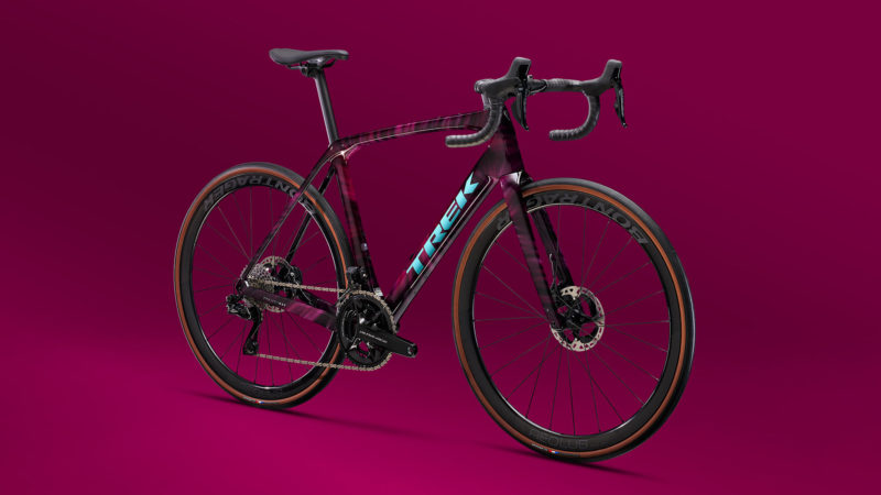
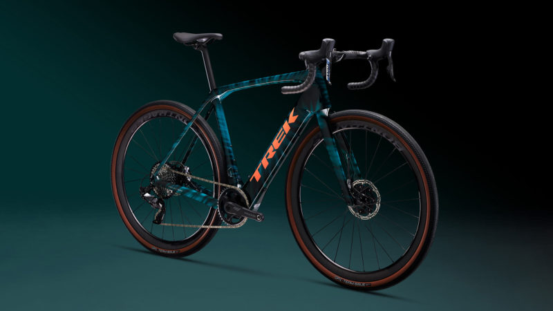
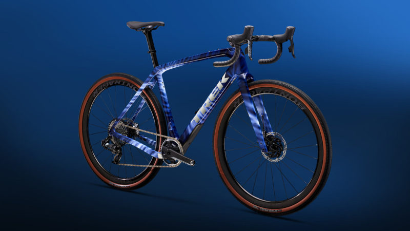
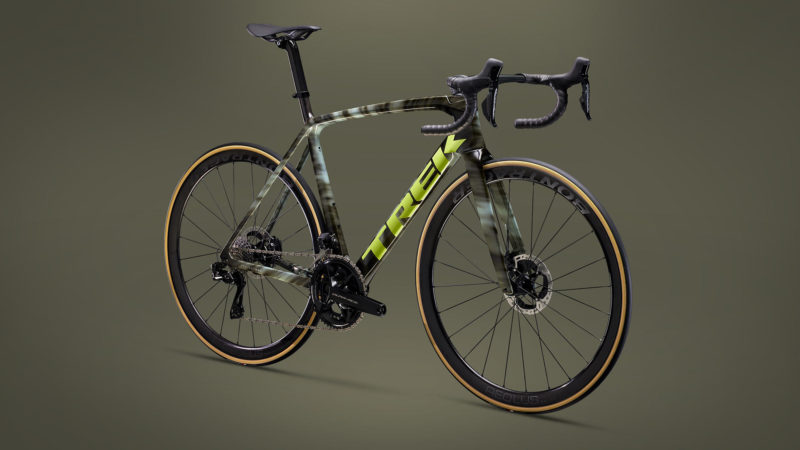
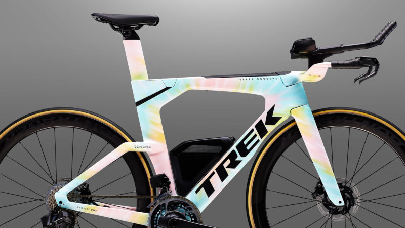
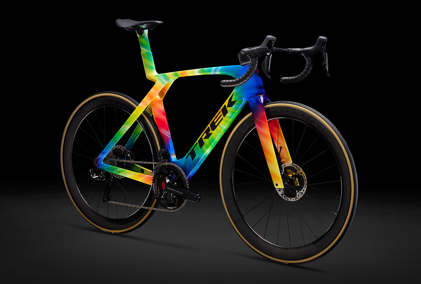
Hot on the heels of their Designer Series, the Trek Project One custom paint program is adding Tie Dye finishes, led by the hippy classic rainbow colors.

Each one is hand-painted in-house, so each is unique and painted to order. Six different hues are available, from multi-color to more subtle monochrome options…

Rainbow Tie Dye

trek project one icon tie dye rainbow paint scheme

Mulberry Tie Dye

trek project one icon tie dye mulberry paint scheme

Juniper Tie Dye

trek project one icon tie dye juniper paint scheme

Shibori Tie Dye

trek project one icon tie dye shibori blue paint scheme

Shade Gray Tie Dye

trek project one icon tie dye shade gray paint scheme

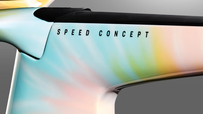
Pastel Tie Dye

trek project one icon tie dye pastel paint scheme

The new ICON Tie Dye paint schemes are available on the Madone SLR, Domane SLR, Domane+ SLR, and Émonda road bikes, the Speed Concept TT/Triathlon bike, and the Checkpoint gravel bike.
TrekBikes.com

Subscribe
Notify of
guest

This site uses Akismet to reduce spam. Learn how your comment data is processed.

8 Comments
Oldest
Newest Most Voted
Inline Feedbacks
View all comments
Billyshoo
Billyshoo
1 year ago

Gorgeous paint! But if I’m spending big money on one of those liveries, I’d want much more subtle TREK branding.

Blake Stephens
Blake Stephens
1 year ago
Reply to  Billyshoo

No… they need to say TREK even bigger.

WhateverBikes
1 year ago
Reply to  Billyshoo

This. In fact, even in the standard colors I’d want more subtle branding. The mega oversized logo’s are garish and loud-in-a-bad-way.

Sammy Cream
Sammy Cream
1 year ago
Reply to  Billyshoo

I agree with Blake. What if they let you go bigger. Or better yet, upside down! That’d be pretty sweet.

blahblahblah
blahblahblah
1 year ago

the rainbow one looks awesome

David
David
1 year ago

Oh my God the one in the first pic looks amazing! I love how it makes that futuristic looking seat tube arrangement look even more wild! It always seems like people find it fun to hate Trek whatever they do but personally I think they’ve done a lot of really cool shit over the years including bikes like the 69er and the Fuel EX+

Exodux
1 year ago

I believe that you can pick your graphic color on the Project One, so that if you wanted a more subdued or color matching graphic, you can go that way. Being that this is a Trek press release, I can see where they would have a graphic that really stands out.

smw
smw
1 year ago

good old SHREK !!!!

Subscribe Now

Sign up to receive BikeRumor content direct to your inbox.